When working with a small house, there's just one rule...
My inspiration was simply vintage. From milk glass to school house lights to hardware. Mixed with modern prints and casual furniture. I gathered items from thrift stores, tag sales, clearance sections of major stores, some of my favorite stores for home goods, and friends (you know who you are... And NO you can't have it back!) :)
If you drove by my house any time the last few months, this was considered the NORM.
If you drove by my house any time the last few months, this was considered the NORM.
We were busting at the seams with furniture rolled out to be painted...
Please enjoy the Beach House tour. And as always, I would love to hear some feedback.
Drum Roll, Please.....
Mudroom:
These chairs were a tag sale find of my mothers from the 50's. They were given NEW LIFE with a fresh coat of white paint and re-upholstered seat.
I switched out the jelly jar light and replaced it with a vintage light bulb.
The Before:
Living room:
Our tutorial on how to paint knotty pine was a lot of work, but it paid off in the long run.
Don't you think?
An old vintage trunk that was left behind in another house makes the perfect coffee table.
The dresser was left behind by the previous home owners and I changed the hardware to give it a new look.
Plus, it hides all of Hannah and Hayden's toys!
The coat rack was also left behind in a closet. I like the 'vintage' look of it and it works great to hold our hats and bags.
Cooper and Harley in typical fashion...
Cooper trying to get some zzzz's and Harley ready to chase you at any time.
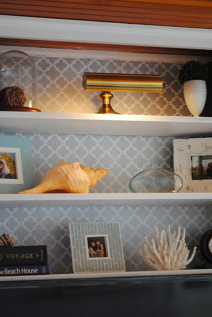
This built-in was a great bonus and displays our knick knacks up out of the way from little hands and holds our t.v.
Before:
The room is so dark and uninviting...
Kitchen:
Our completely gutted kitchen!

What do you think about the lighting?
Before:
Sunroom:
Mr. House installed some pergo floors and ripped out the 20 year old carpet.
Vintage globes adorn the top of this built-in curio and the counter doubles as a bar.
Before:
Master:
By moving the bed in front of the window, the room flowed better than before. One thing that I really don't like is when you stand in a bedroom door and all you see is the foot of a bed. When you walk into a room you need a focal point, which in a bedroom, usually is the bed. There is no mistake where your eye is drawn to is this room. The bright mix of patterns and stacked gallery of frames make the room pop.
That being said, I'm also not a 'fan' of putting a bed in front of a window, but I had to weigh it all out and make the best choice.
Before:
yes, we burnt every last one of those frilly curtains.
The Kiddo's Room:
A friends' night stand painted white and given a shiny new piece of hardware makes a super cute table for the kids to sit and play at.
This bunk bed was left behind as well. I had Mr. House install a 'pipe guard rail' for safety. We are planing to do something fun for the stairs. Another project, for another time.
Before:
Guest Room:
Another dresser left behind. I painted this one white and updated the hardware. This is great to store sheets and additional essentials when you don't really have the storage.
My daughters water color painting was the perfect choice to display in this frame. It has all the colors of the room!
Another dresser left behind. I painted this one white and updated the hardware. This is great to store sheets and additional essentials when you don't really have the storage.
The orange and white blend seamlessly with these punchy pillows. The butterfly pillow pulls all the colors in the bedding together.
Before:
BAM! Once a frumpy guest room, now a chic and colorful guest room.
The Head:
A new suttle paint color, a new mirror, light fixture and shower curtain take this bathroom to a whole new level.
Before:
Holy Moly! I don't even know what to say here!
Well, what do you think? Can you guess the one thing throughout the house we didn't touch?
Do you have a second home that you want to spruce up, but don't have a big budget? Do you want to change the look of a room, but you don't want to invest a ton of money? Do you need a quick idea for a room?
What are you waiting for?!
Click here to contact House by Holly.
From my house to your house, Happy Hunting!
Let's Connect!


Are you looking for ideas to add to your decor? Are you stuck in a rut and need some fresh ideas? Let me HUNT for you! Email me at HousebyHolly@yahoo.com for a consult.
To follow my posts, join me on Facebook.
If you enjoy reading HOUSE by Holly, please click the "like" button at the top of the page for Facebook. Or visit http://www.facebook.com/HouseByHolly and hit "like".
I will be sharing extra tips and tricks on that Facebook page I created.
And as always, I love to hear from MY READERS! Please leave me comments, post projects you have tried and feel free to ask me questions.
Linking to:Life On Virginia Street,


Thanks so much for sharing ! You show how taking simple items can be converting them into very attractive and enjoyable item and do it on a budget. Keep up the great works !!
ReplyDeleteThanks Doug!
DeleteAll you need is a little imagination... and a lot of paint! ;)
Thanks for stopping by!
Holly
GREAT work! I love the vintage feel! The floors, walls and ceilings are to-die-for. Very nice and simple overall. LOVE it. The ceilings are the one thing you didn't touch throughout, right?
ReplyDeleteThanks so much Trudy! Ding, Ding...We have a winner! ;) Yes, the ceilings were the only thing we didn't touch. I love the contrast and how they warm all the rooms perfectly.
DeleteThanks for stopping by!
Holly
Incredible. You really did an amazing job.
ReplyDelete( I told ya I look at your stuff !!)
Donny Frost
Thanks Donny! ;)
DeleteIt was a lot of work and now it's time to enjoy it! We'll have to get you guys out here soon...
Holly
Beautiful! Love the watercolor. Thanks for linking up!!
ReplyDeleteI love the easy, comfortable feel of the place, just what a second home should feel like.
ReplyDeleteThanks Jamie!
DeleteExactly, now I can relax! ;)
Holly
I love all of it! Can I come visit sometime? :)
ReplyDeleteWe'd love to have you come link up at Remodelaholic.com where we host a Remodelaholics Anonymous linky party every weekend (Friday through Monday) for all types of home projects. Come share this or any of your other posts, too!
Thanks Lorene!
DeleteDon't mind if I do...
Holly :)
After moving into a new house, decoration is the next thing to do for new homeowners. This brings excitement to them, especially to the woman of the house. You can buy a house that meets your family needs without sacrificing your style. Just look at you house interior now. Everything turned out amazing. Congratulations!
ReplyDeleteCalvin Mordarski @City Block Team
What a cozy house! You know, there's always something about wooden things that makes them look fancy and expensive when put in a room. You have picked the right combination of colors and the lighting is great too. Good job on the house interior design!
ReplyDeleteLevi Ervin @Virginia Churchill Mortgage
What a wonderful makeover. You did a great job. It is amazing how much brighter it looks. So cheerful instead of drab. Just delightful. You scored some great "left behind" items also. Great dressers. Got love that price tag. Really nice cottage.
ReplyDeleteTonita @ www.ShabbyChicTinyRetreat.blogspot.com
I am so happy to have found your blog! We just bought a beach house and it's all knotty pine with cypress ceilings. I have been agonizing over painting the walls white because the original part of our house is historic so I feel a little guilty! Yours turned out great and really brightened everything up. Now I just have to talk my husband into tackling this big job with me!
ReplyDeletesubtle not suttle :-)
ReplyDeleteVIGSHOME has extremely affordable furniture prices. There is a marble table, a king-size bed, a vintage table, a wandering job work desk, desk cup holder, a back couch, armless sofa, marble dining table, and more with quality services.
ReplyDelete